The Chart That Broke Our Brains
By Colin McAuliffe (@colinjmcauliffe) Sean McElwee (@SeanMcElwee)
The New York Times recently published a piece that explored why many of the people who depend on government assistance end up voting for Republicans, the one political party which is not only determined to cut all forms of government assistance but is openly hostile to the concept of government itself (at least the parts of government that don’t kill, imprison, or spy on people). The article offered several important insights, although we will add a few caveats to it here, but mostly the article caught our attention because of a very strange trendline on a chart.
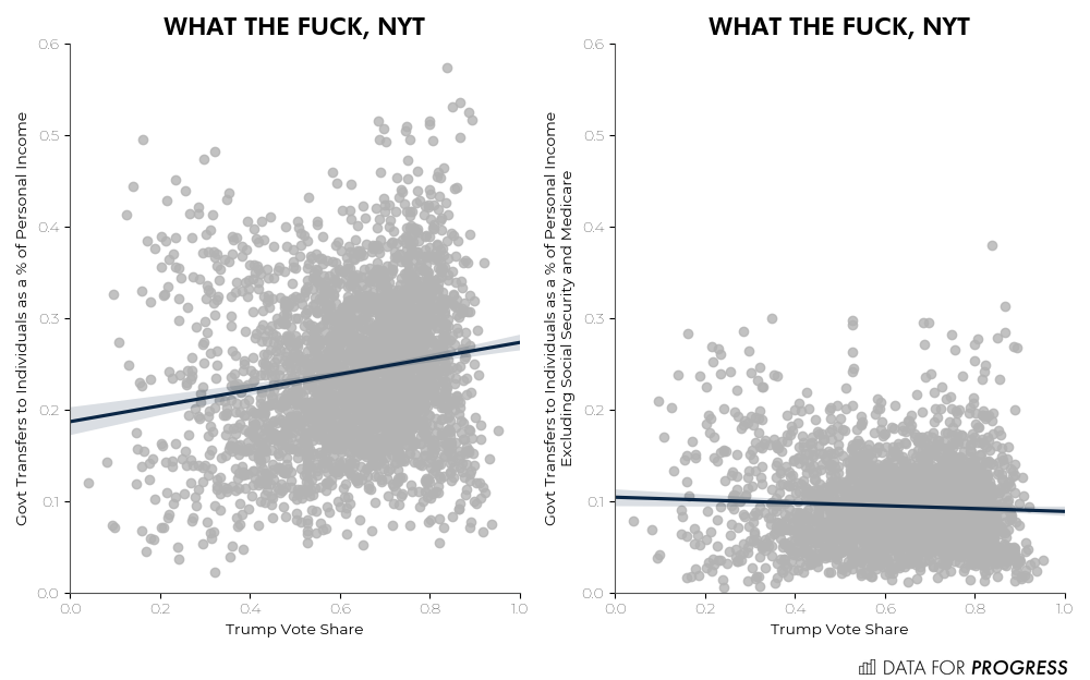
The plot compares county level Trump vote share and the county level percentage of personal income that comes from government transfers, which includes things like Social Security, Medicare and other public assistance for medical care, the Earned Income Tax Credit (EITC), nutrition assistance, disability insurance, unemployment insurance, and a few others.
The nearly vertical trendline looked so strange to us that we decided to replicate the plot, and found a very weak correlation between these two variables, which disappears entirely when Social Security and Medicare are excluded from the tally of government transfers (see chart). This prompted a fair amount of discussion on how it was possible for NYT to have generated that trendline in the first place. The trendline seemed so strange that most of us missed the simple explanation that the trendline was plotted with the x and y axes reversed, which apparently is an easy mistake to make.
However, neither the corrected trendline, nor our alternate regression excluding Social Security and Medicare disprove the central thesis of the piece. Far from it in fact! Excluding Social Security and Medicare from our definition of government transfers basically eliminates the county level correlation between Trump share and transfers. However, the reason for this is that Social Security and Medicare are a strong proxy for age. Age is well established as a strong predictor for voting for Republicans, who in turn are hell bent on cutting the Social Security and Medicare that keeps seniors out of poverty and provides them with the medical care they need.
Setting age aside for a moment, the lack of correlation between county level government transfers after excluding medicare and social security and Trump’s vote share doesn't mean we can dismiss the idea of an underlying association. That’s because the data is aggregated, which can cause statistical trends to get hidden or even reversed. This is known as Simpson’s Paradox, which is illustrated really nicely in this gif. To avoid the problems of aggregation, we should be using individual level microdata, which are available from large sample surveys like the Cooperative Congressional Election Studies.
To explore further we’ll use a multilevel regression model, which extends the ordinary regression model we used earlier. A multilevel regression model provides a framework for a central planner to incorporate additional information and structure into an analysis. This results in the redistribution of statistical power which leads to more stable models that make better use of limited data.
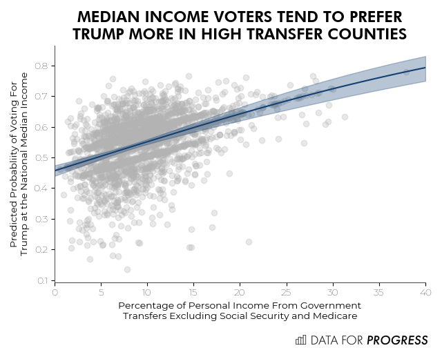
In particular, we regress the propensity of individuals to vote for Trump based on their family income, and we allow this relationship to vary by county. This helps with the aggregation problem, but then we end up with many counties where we don’t have enough data to fit a model for income. This is where the multilevel model comes in, we incorporate the county level transfer income data by putting a county level regression on top of our individual level regression. This redistributes statistical power from counties with rich data to counties with sparse (or no) data, but still allows us to avoid aggregating the data together and losing information. A very similar model using states as opposed to counties can be found in one of the original text books on multilevel models by Gelman and Hill.
We find that there is indeed a relationship between increased Trump preference and living in a county where a larger portion of personal income comes from government transfers (after excluding social security and medicare). The trend is not particularly strong, but not negligible either like the aggregated data suggests.
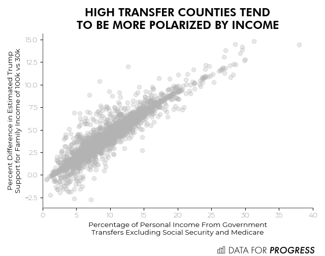
To fully understand these results, we have to dig deeper. There is a striking increase in polarization by income in high transfer vs low transfer counties. Upper middle income voters who are unlikely to receive much in transfers themselves, but live in counties who are highly dependent on transfers are very Republican, while their lower income neighbors are much less so. In other words, the trend of increased Republican preference in counties that are highly dependent on transfers is not primarily driven by increased Republican preference among those who are receiving those transfers. Instead, the trend is much better explained by more well off (and likely resentful) residents of those counties. This tracks closely with the result that Gelman and Hill found in their original multilevel model for the variation of voting patterns by income and state (also see here).
While this analysis adds a few important layers of complexity relative to the county level regression, there are still a number of other important factors we haven’t accounted for yet. Our analysis only considered preferences among those who actually voted. According to data from Civis Analytics, West Virginia (a high transfer state) has the largest opinion gap between voters and non-voters. In a recent Data for Progress study published in Perspectives on Politics, we showed that in economically distressed areas, Democratic voters abstained from voting (see also studies on Medicaid expansion). Since so many people at the bottom of the income scale are not voting at all, this complicates narratives about transfer recipients preferring Republicans. Race is another factor that can’t be ignored, since research has shown that fear of losing status was a potent force driving whites to vote for Trump.
There is no doubt that there is a sizeable number of people who rely on government transfers but vote for Republicans. The best example of this is elderly white people, who turn out in huge numbers and overwhelmingly support the party that wants to cut Medicare and Social Security. For the nonelderly, the story is much more complicated, but there is truth to it nonetheless.
Colin McAuliffe (@colinjmcauliffe) is a co-founder of Data for Progress.
Sean McElwee (@SeanMcElwee) is a co-founder of Data for Progress.


