Public Housing Maps
Interactive Map: American Public Housing Communities
This map shows the breadth and diversity of American Public Housing Communities, which are found in cities and rural areas all across the country. Green investments in public housing and low-income workers across the country will help lift up under-invested communities countrywide.
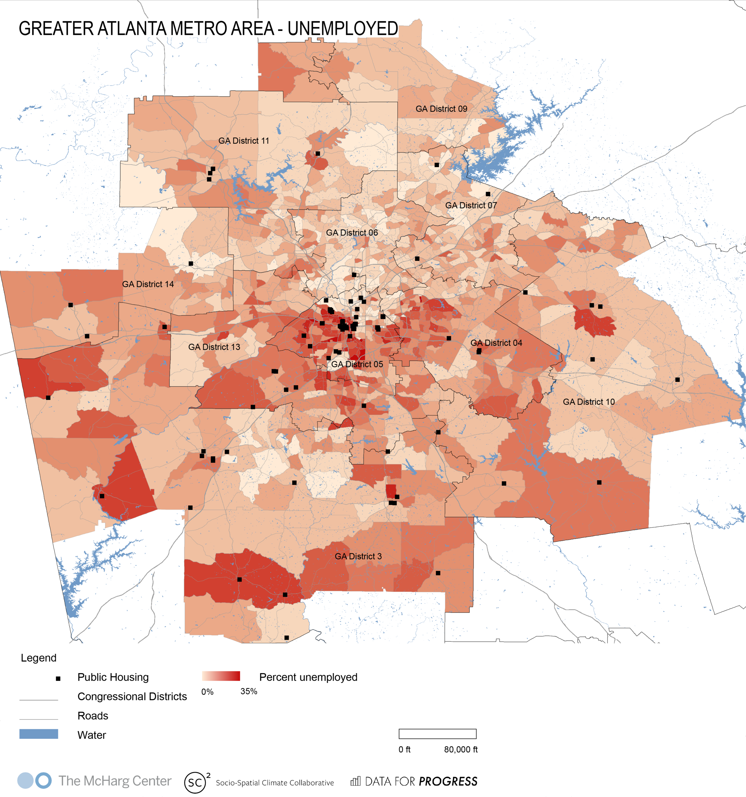
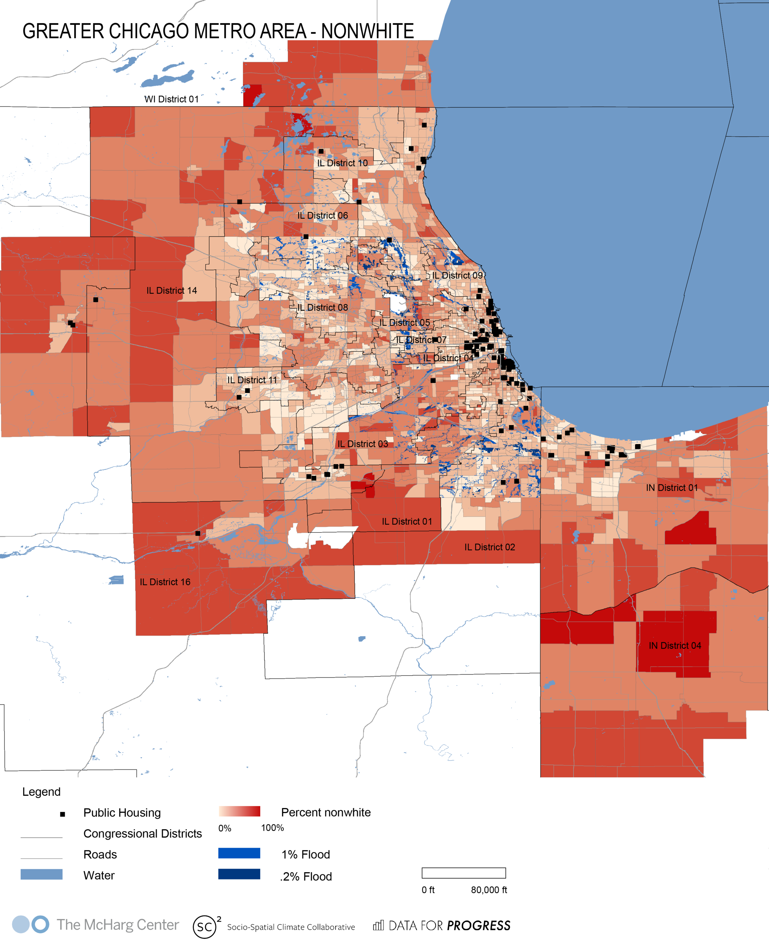
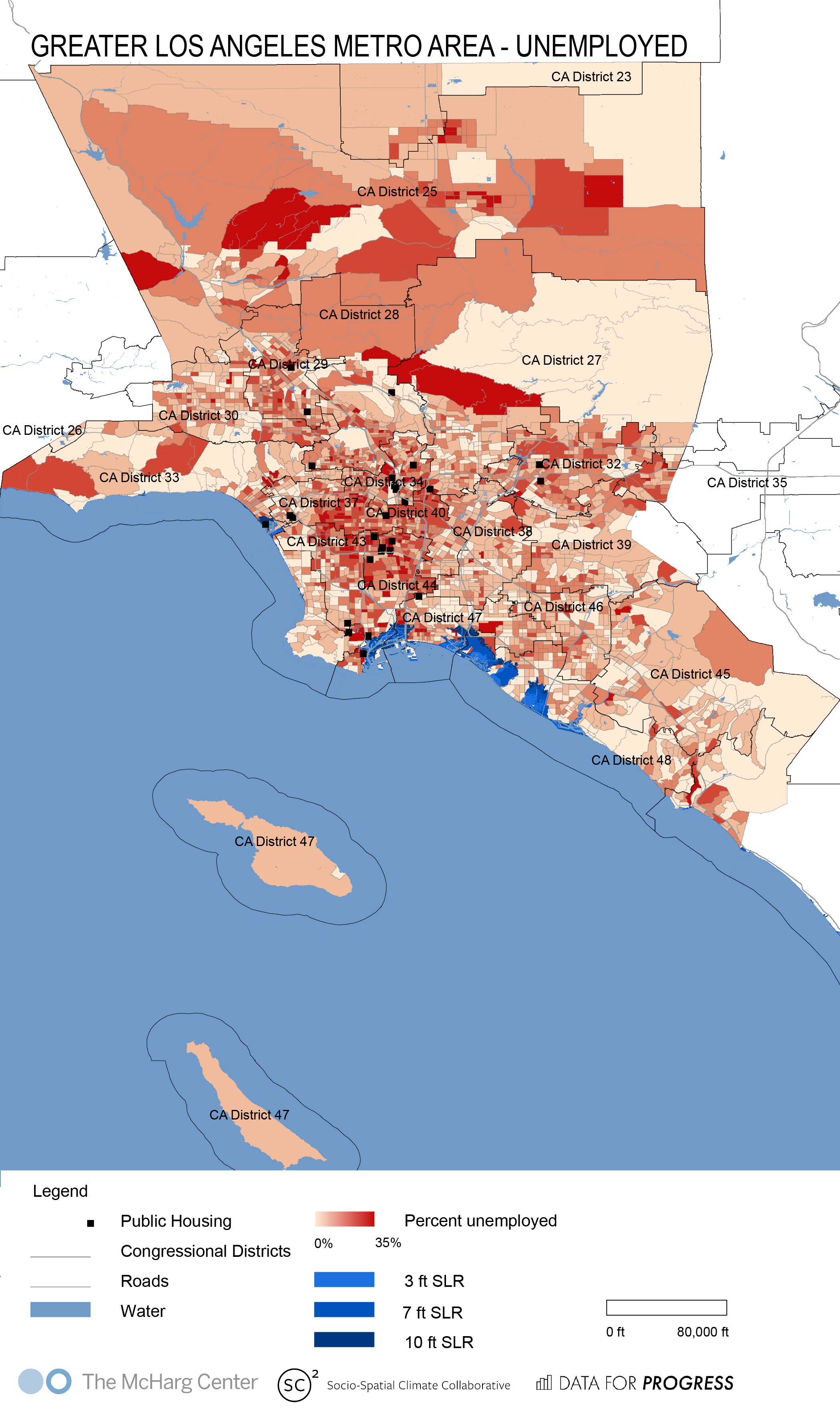
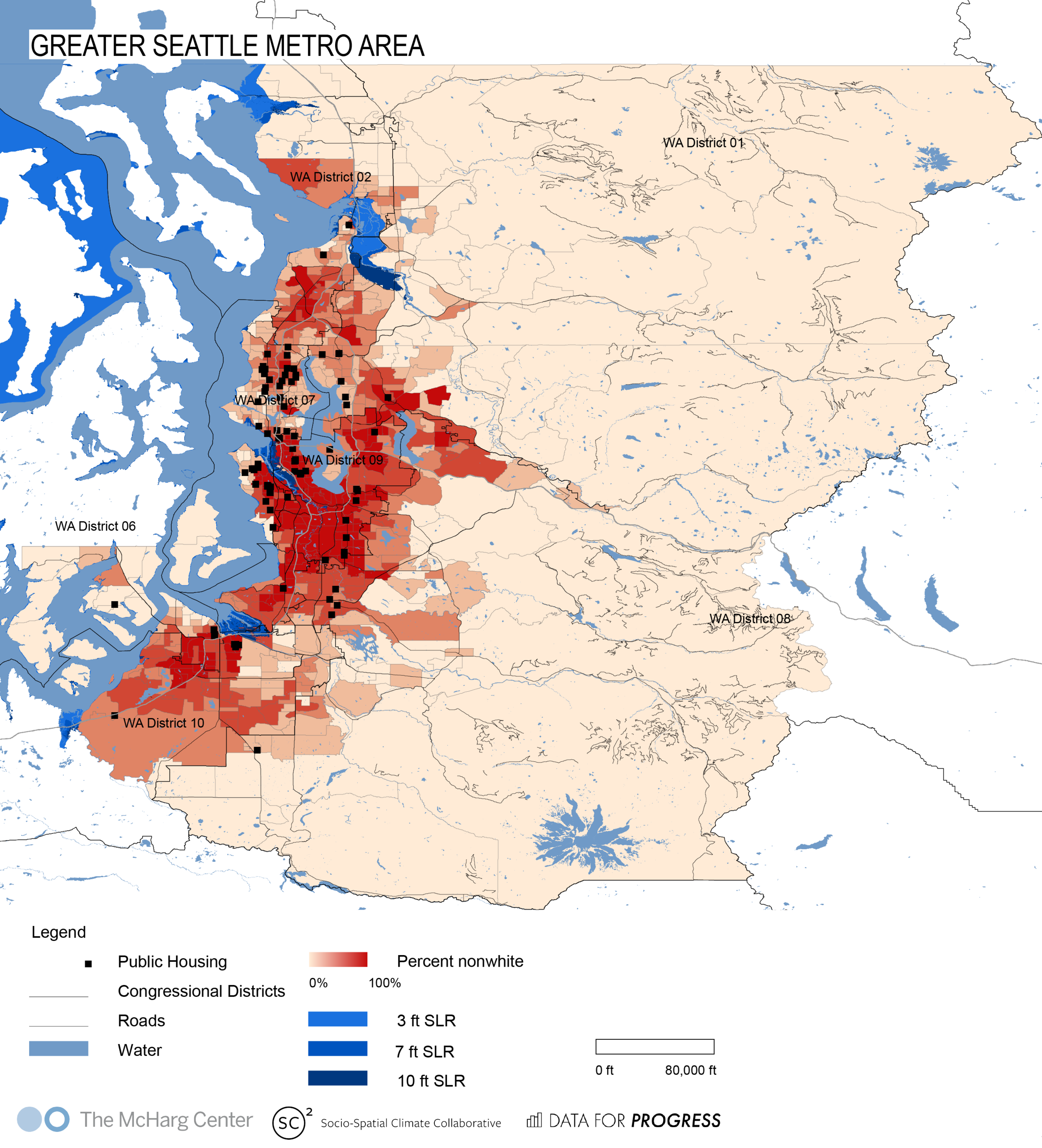
By selecting one variable at a time in the legend, see the location of public housing buildings against a background of census tract-level unemployment rate, percent below federal poverty line, percent nonwhite, and population density. Use the search bar to find any town or city that interests you.
Interactive map credit: Katie Lample, Nick Graetz, Alexandra Lillehei, Daniel Aldana Cohen, Billy Fleming (Data for Progress and McHarg Center), with support from the McHarg Center, Socio-Spatial Climate Collaborative, Data for Progress, and the Price Lab for Digital Humanities. Data on public housing locations is based on the the US Department of Housing and Urban Development’s data on Public Housing. Census tract-level data is from the American Community Survey, the 5-year pooled data, 2013-2017.
Snapshots: Public Housing Communities in Urban and Rural America
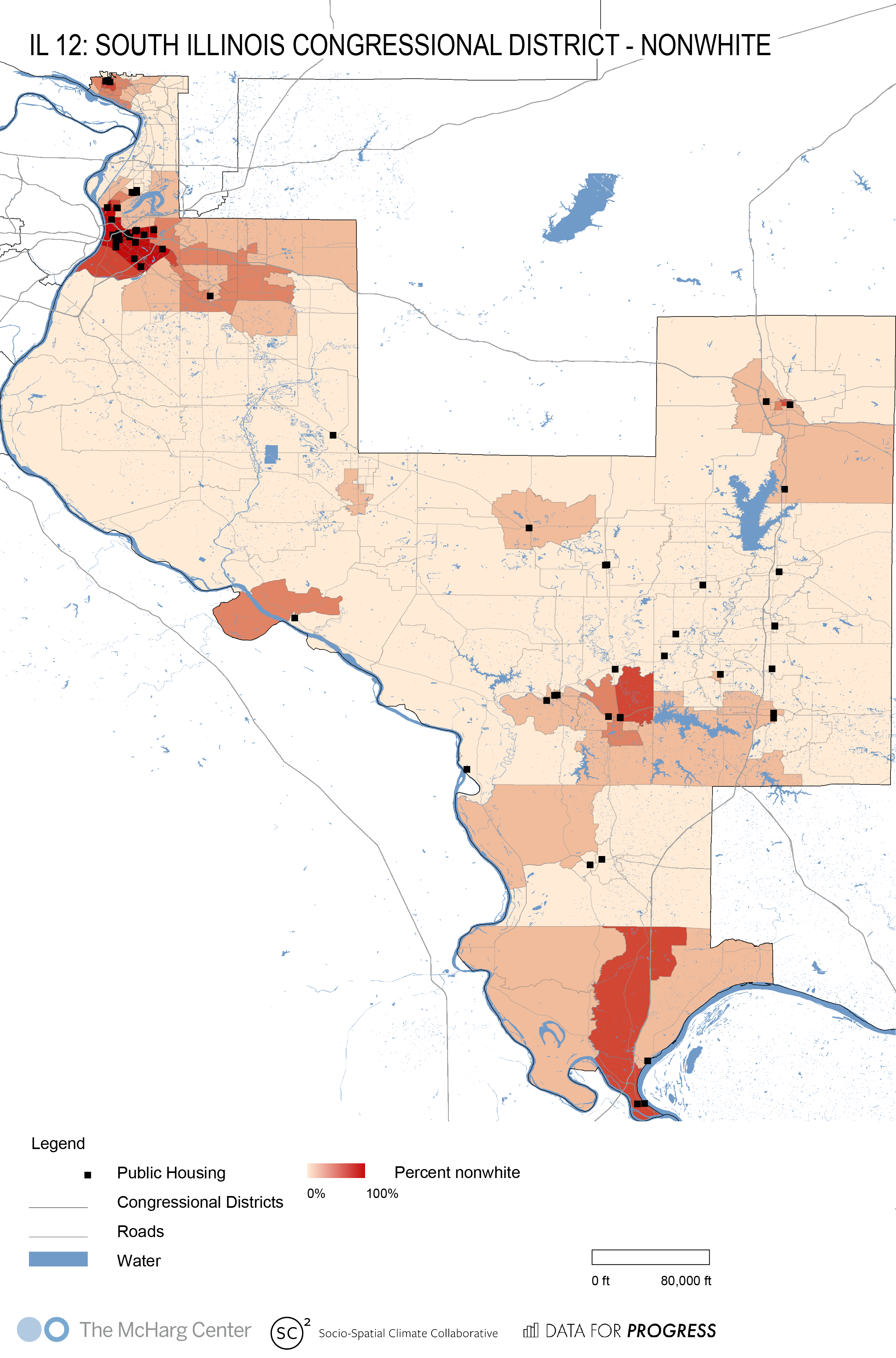
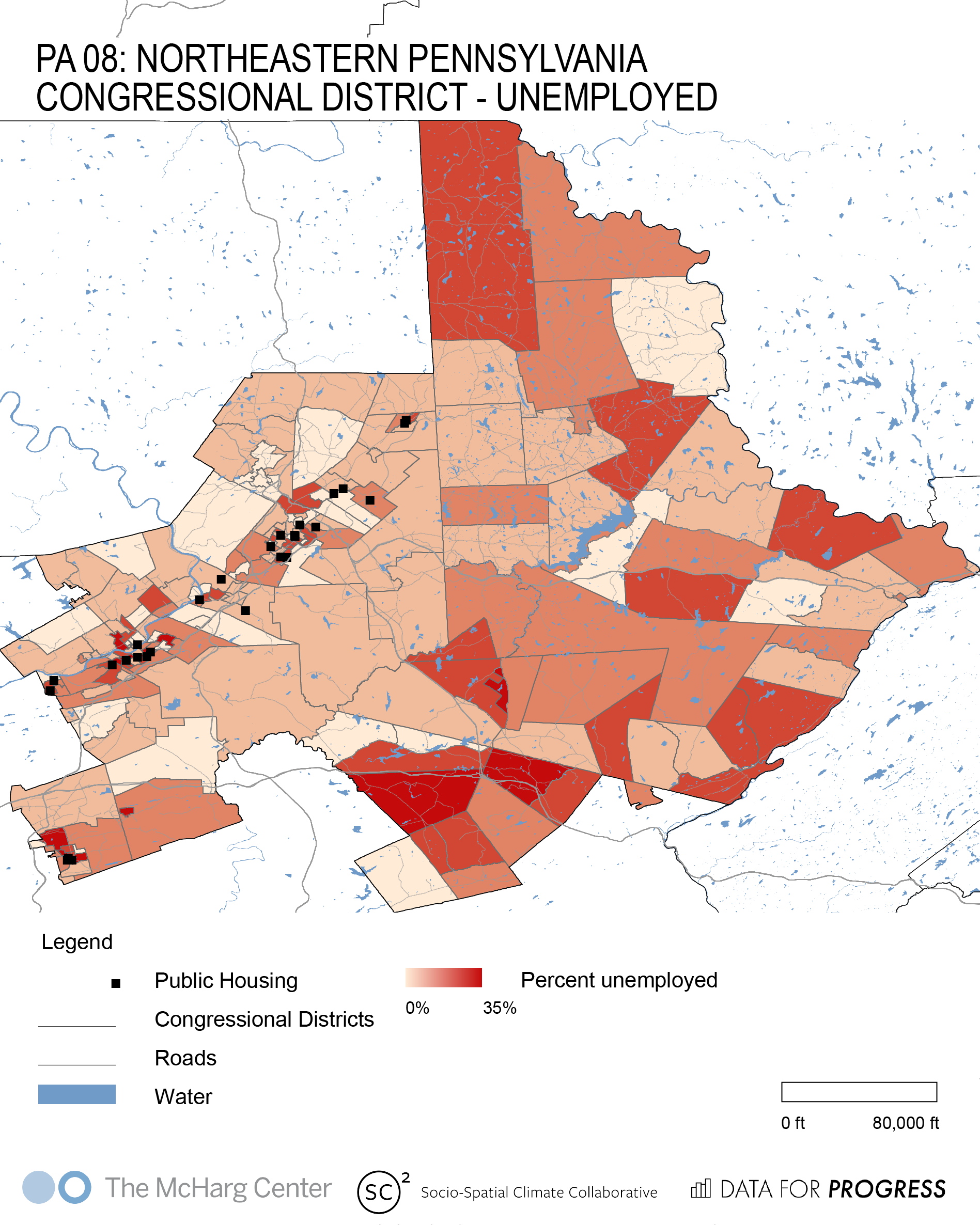
American public housing communities are found in red states and blue states, red districts and blue districts, cities and rural areas. Scroll down to see maps of 7 cities and 3 rural districts (for more see our NYCHA maps).
The maps below show public housing in both white communities and communities of color. (Against the stereotype that public housing now only serves inner city communities of color, overall, more than one third of American public housing residents are white.) Public housing communities are also under threat from sea level rise. The maps below show snapshots of public housing in a diverse array of communities, their vulnerability to sea level rise, and the need for new green investment and new green jobs in these communities, as demonstrated by their high rates of unemployment.
Blue shading indicates a gradient of projected sea level rise, from 3 to 10 feet. This is also a good proxy for flood risk during high tides, storms, and hurricanes. There will almost certainly be over 3 feet of sea level rise by the end of the century. And while is is unlikely that there will be 10 feet of sea level rise, the areas shaded darkest blue, which would be under water at 10 feet, will be flooding increasingly often as time passes. Only dramatic cuts to carbon emissions can contain the rising seas. Additional data beyond the dynamic map above, on sea level rise, is from the National Atmospheric and Ocean Administration. Static maps credits: Alexandra Lillehei, Nick Graetz, Katie Lample, Daniel Aldana Cohen, Billy Fleming (Data for Progress and McHarg Center), with support from the McHarg Center, Socio-Spatial Climate Collaborative, Data for Progress.
Urban Maps
Atlanta
Boston
Chicago
Los Angeles
Miami
San Juan
Seattle
Rural Maps
AL-04
IL-12
PA-08


